Modernizing Mobile Checkout with Apple Pay
It was 2020, and suddenly, everyone was ordering food online. The COVID-19 pandemic had made takeout and delivery the go-to dining options for millions of people, and businesses like Papa John’s had to adjust quickly. As demand surged, so did our customers’ expectations. They were used to quick, frictionless transactions in other areas of their lives, and when it came to pizza, they wanted the same experience.
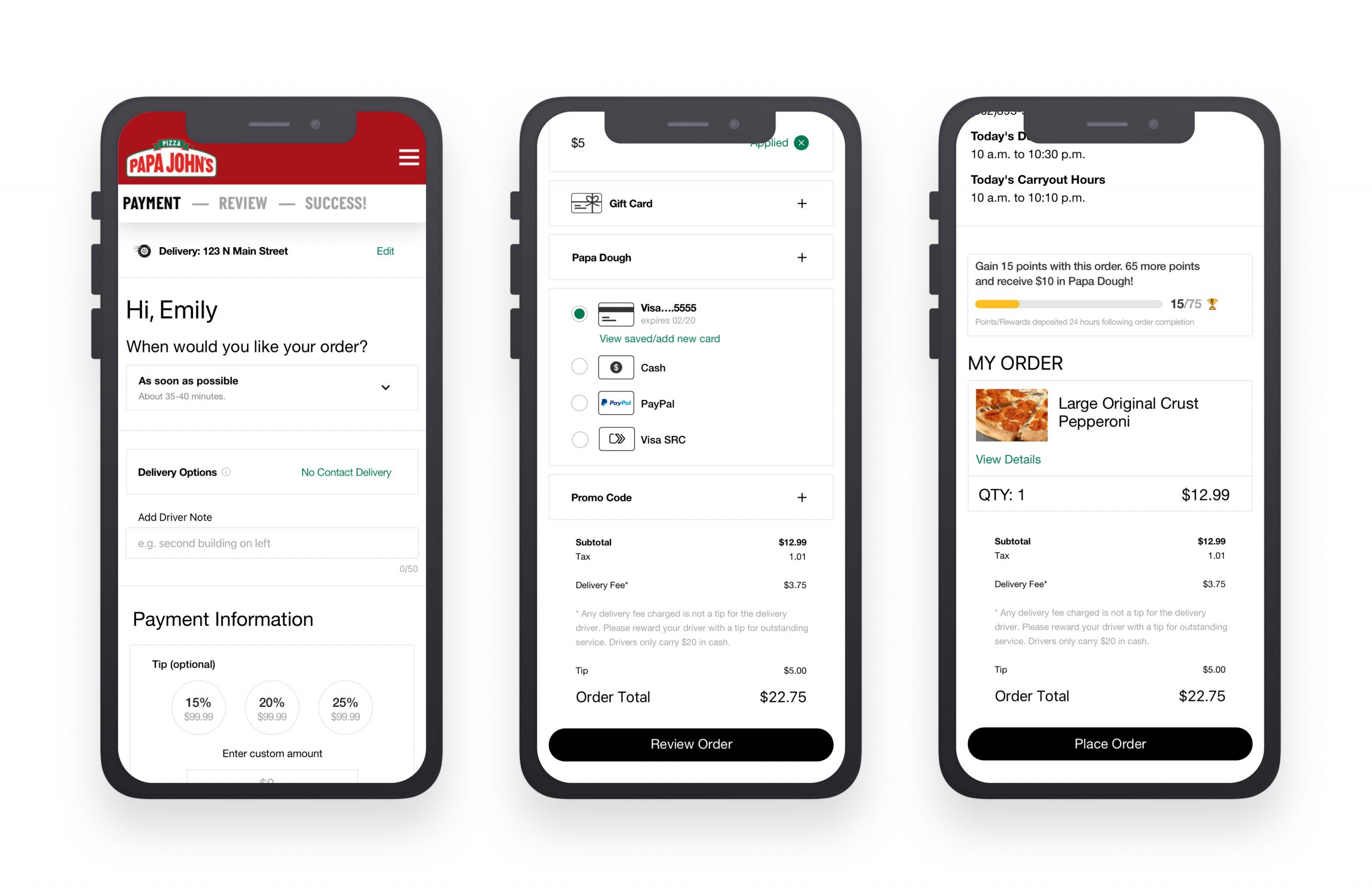
But here’s the thing: our checkout process just wasn’t cutting it. We were hearing loud and clear that customers wanted faster, more convenient ways to pay. Apple Pay and Google Pay were becoming household names, and our checkout was still stuck in the past limited to just credit cards, cash, and PayPal. Even worse, users were frustrated with how hard it was to switch between payment methods or add a promo code. The process felt clunky and outdated.
We had to ask ourselves:
How might we make the Papa John’s checkout process as easy, quick, and modern as the pizza we’re delivering?
Listening to the Customers as the First Step
We didn’t just guess what was wrong; we listened. User feedback flowed in, and we saw a consistent theme: people were annoyed by jumping through too many hoops.
- Payment options were limited, and people wanted more choices, especially mobile payment options like Apple Pay and Google Pay.
- Adding promo codes wasn’t intuitive—it was hidden behind a dropdown, which meant customers often missed the chance to save.
- The checkout was split across multiple screens, making it feel like a game of back-and-forth. People didn’t want to fill out their contact info, then pay, then choose delivery options—it should all be right in front of them.
And then, we did something crucial: we asked users to rank the checkout steps in order of importance. Here’s how it broke down:
- When will my pizza arrive?
- How will I get my pizza? (delivery or pickup)
- How do I pay?
- Let me review my order.
This gave us clarity about the flow we needed to create.


Designing the New Checkout Flow from Concept to Reality
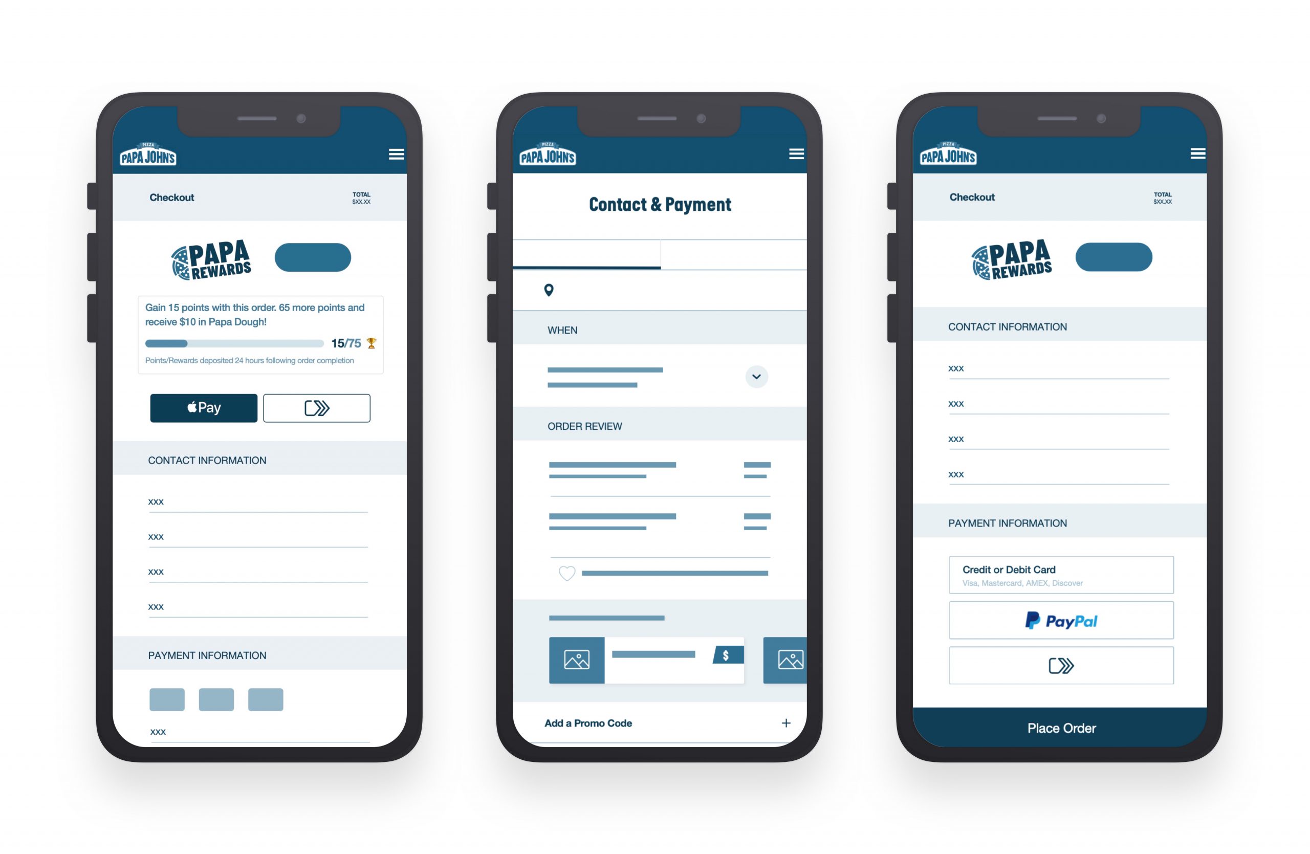
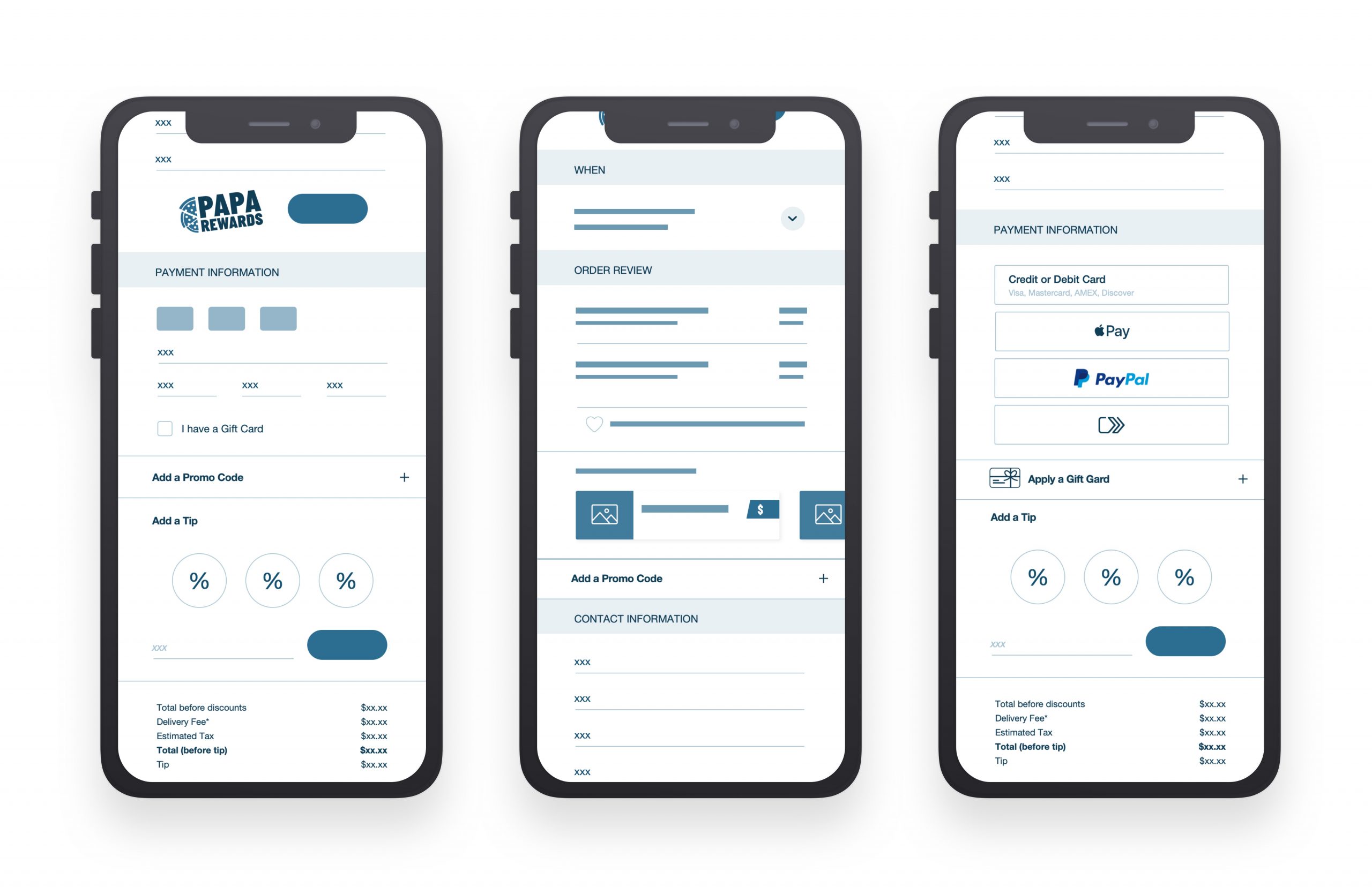
Armed with this feedback, we started sketching out new wireframes. This was our chance to get everything on one page, literally. We wanted a checkout that felt seamless, with everything in sight payment methods, promo codes, gift cards, and even rewards points. We also wanted to keep it simple and easy to navigate, especially on mobile.
At this point, we began testing ideas with real users. Some of the insights were instant and eye-opening:
- People liked the idea of having all the checkout steps on one screen. They would no longer have to click through separate pages for contact information, payment information, and delivery details. Everything needed to be visible and intuitive from the start.
- The promo code and gift card fields were hidden behind dropdowns, making them feel like an afterthought. Users wanted those exposed front and center.
- Apple Pay and Google Pay? It became clear that mobile payment options needed to be much more prominent. We wanted users to feel like paying with their phone was just as easy as paying with a credit card.

Bringing the Design to Life with Key Changes
We took all of these learnings and put them into action. Here’s what we ended up with:
One-Pager Checkout: We consolidated everything onto one screen. No more bouncing between separate pages to input your contact info, choose delivery, and select payment. Everything was on one seamless page, allowing users to quickly move through the process without confusion.
Visibility and Accessibility: We exposed all the important content right away. Promo codes, gift cards, and Papa Rewards were no longer hidden behind dropdowns. If you had a discount or a gift card, it was easy to find and use. The goal was to make it all visible and ready to go, no guessing.
Mobile-First: Since so many people were ordering from their phones, we made sure the experience was perfectly optimized for mobile. Buttons were big and tappable, and everything fit neatly into the screen, regardless of your device.
Streamlined Payment: And yes, we made sure that Apple Pay and Google Pay were given prime real estate in the checkout flow. Mobile users would now be able to complete their purchase with just a tap faster and smoother than ever before.
Final Thoughts On a Job Well Done
Looking back at the whole process, we’re proud of what we accomplished. Papa John’s Checkout Refresh wasn’t just about updating a few buttons or adding a new payment method it was about making the entire experience smoother, faster, and more aligned with the expectations of modern users. By paying attention to customer feedback, designing with simplicity in mind, and optimizing for mobile, we were able to deliver a checkout process that met the needs of our customers in a world that was increasingly digital-first.
This wasn’t just about selling more pizza. It was about delivering a better experience from start to finish. And in the end, that’s what made this project a success: we took the time to understand our users and crafted a solution that not only worked for them but made ordering pizza feel a whole lot easier.
ROLE: UX Designer
TOOLS: Sketch, Invision, Jira, Usertesting.com
