Creating a Unified Web Experience for an All-Girls High School
Background & Challenge
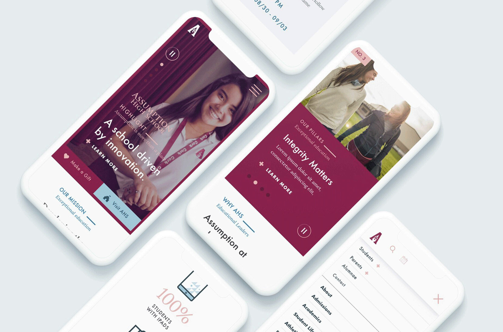
Assumption High School (AHS), an institution with a rich history and diverse community, wanted to create a more engaging, intuitive, and mobile-friendly website. The goal was to improve the digital experience for multiple user groups: current and prospective students, parents (current and prospective), and alumnae. Each of these groups had different needs, which needed to be addressed in a unified, user-friendly design.
We were tasked with redesigning the website to make it not only more accessible and easier to navigate but also to ensure that it truly represented the spirit and values of the school.
Research & Discovery
To understand the needs and expectations of the different stakeholders, we began by conducting a comprehensive research phase:
Stakeholder Interviews: We met with administrators, teachers, parents, students, and alumnae to gain insights into their current frustrations, goals, and what they wanted to see in the new website. We also reviewed analytics from the old website to identify any usability or navigation issues.
Onsite UX Workshop: We facilitated a collaborative workshop with stakeholders to explore their perceptions of the website, its strengths, and areas for improvement. This workshop helped us align on key priorities and define the user experience goals for the new website.
Affinity Mapping & Brand Prioritization: We conducted an affinity mapping exercise to group feedback, ideas, and features that emerged from our interviews. This allowed us to identify themes and trends. At the same time, we worked with the AHS team to prioritize the school’s core brand attributes, ensuring that these were incorporated into the design process.
Proto-Personas: Based on our research, we created proto-personas that represented the key target audiences: prospective students, current parents, alumnae, and current students. These personas helped us visualize the users’ needs, motivations, and pain points.
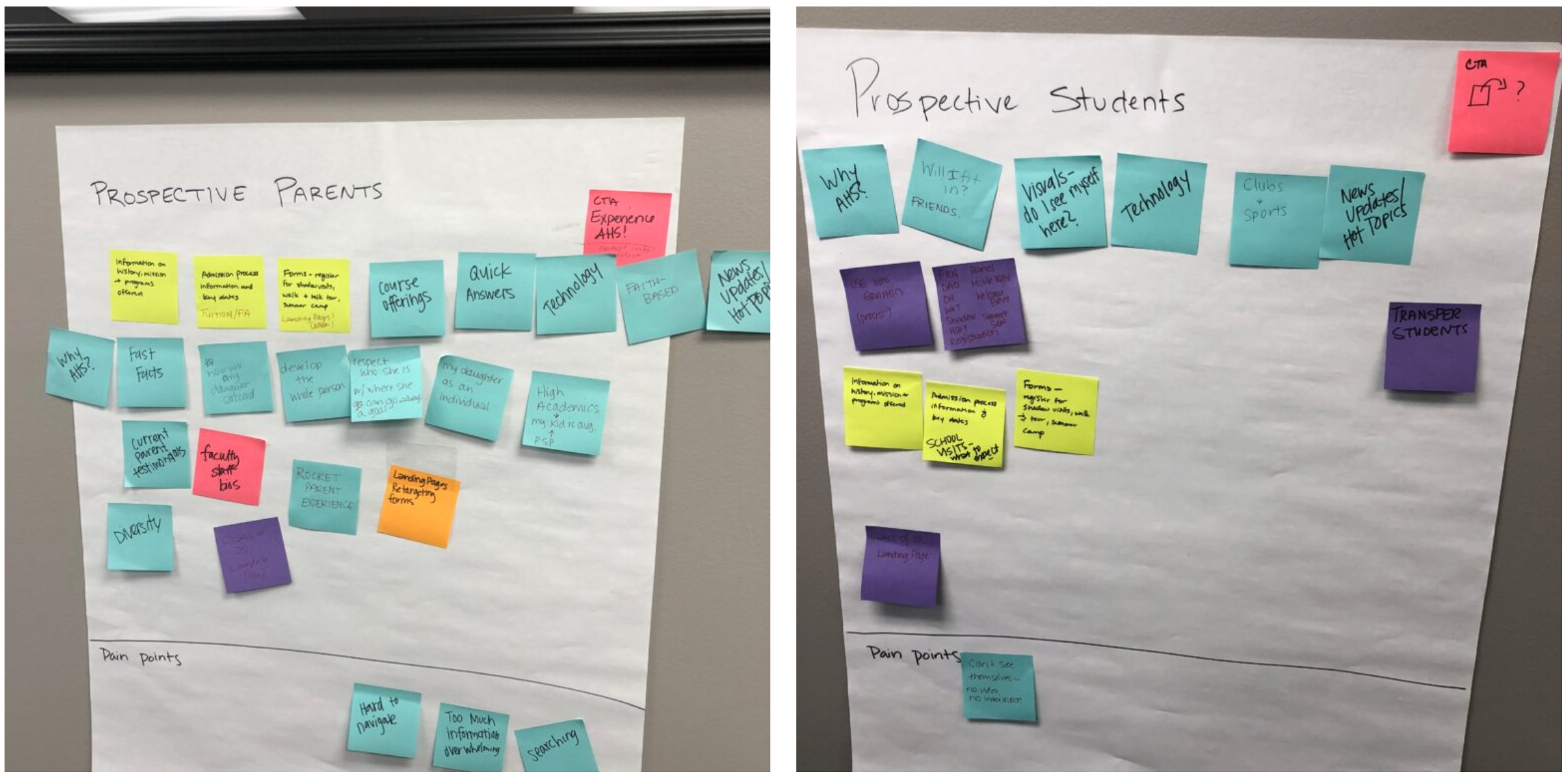
Based on our research and insights, we formulated a How Might We (HMW) statement to guide our design thinking and problem-solving process:
How might we design a mobile-first website that serves the diverse needs of prospective students, parents, and alumnae while embodying the mission and spirit of Assumption High School?
This statement served as a framework for ideation and decision-making throughout the design process, keeping the needs of the target users at the center of our work.
Ideation & Conceptualization
Once we defined the scope and goals of the project, we began brainstorming possible solutions. The ideation phase involved several key activities:
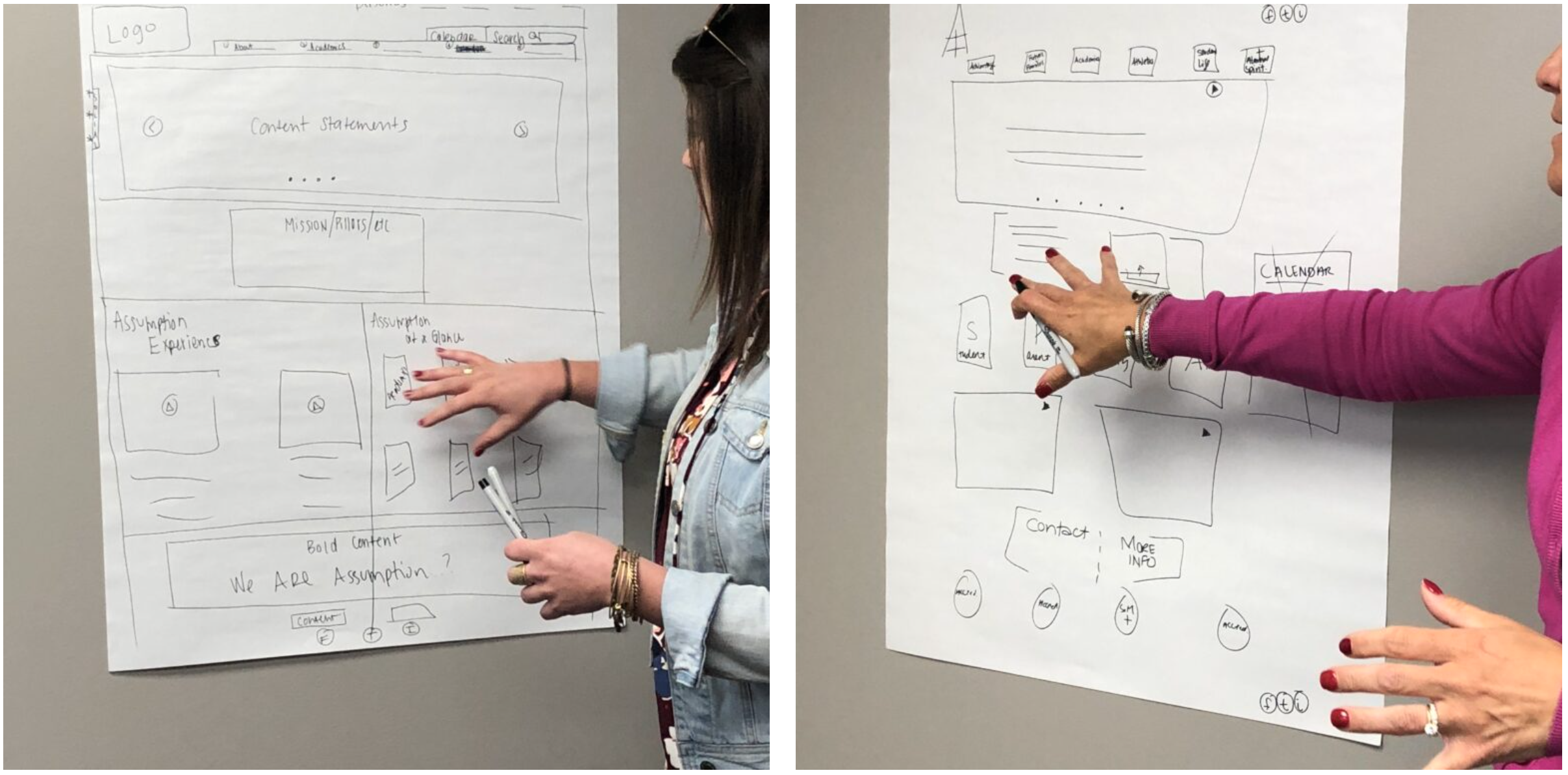
Stakeholder Sketching Exercise: One of the most engaging activities we conducted was asking stakeholders to sketch their vision of the ideal homepage. This exercise was valuable for several reasons:
- It encouraged stakeholders to think about the website from a user-centric perspective, considering what students, parents, and alumnae might prioritize.
- It helped surface ideas that we might not have otherwise explored and sparked healthy debate on what should be prioritized on the homepage.
- It empowered stakeholders to feel ownership over the design process, making them feel like collaborators rather than just decision-makers.
By involving stakeholders in the design process, we fostered empathy for the different user groups. Stakeholders who might have been initially focused on institutional needs began to see things from the perspectives of parents, students, and alumnae.
User Flow & Information Architecture: We worked closely with AHS to define the most intuitive information architecture, based on feedback from the stakeholder interviews and persona research. The user flow was designed to be simple yet comprehensive, ensuring that users could easily find information about admissions, events, school life, and alumnae networking opportunities.
Wireframing & Prototyping: Using the insights from our research and stakeholder input, we created wireframes and low-fidelity prototypes. These were tested with real users (prospective students and parents) to ensure that the navigation, layout, and content met their needs.
Design & Refinement
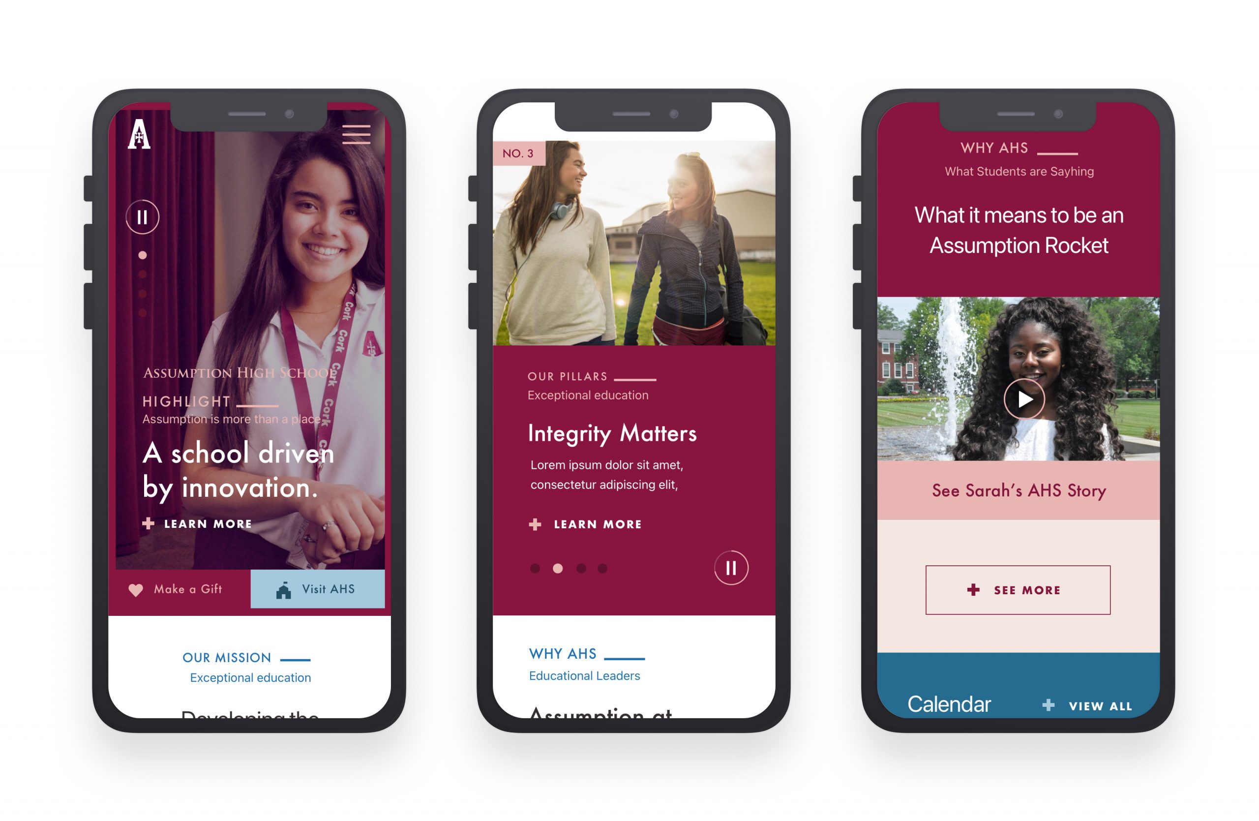
With the wireframes approved, we moved into the high-fidelity design phase. Our focus was on:
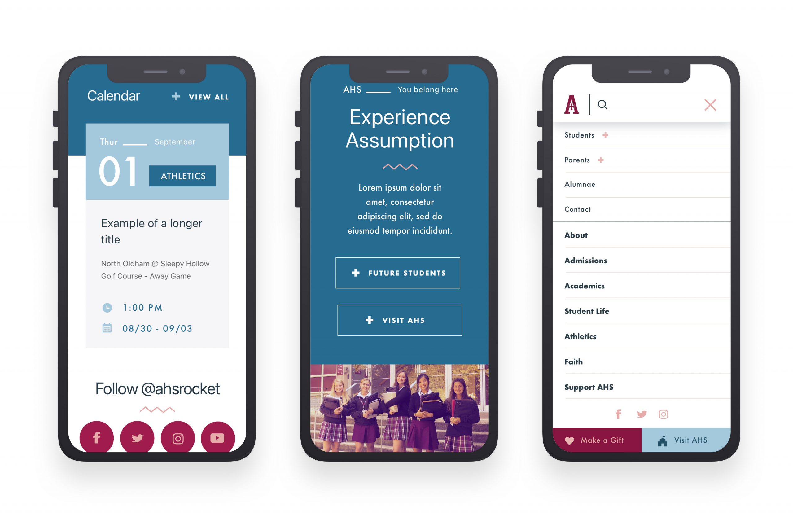
Mobile-First Design: Given the increasing use of mobile devices for browsing, we prioritized creating a responsive, mobile-friendly design. Key pages, such as admissions, events, and student resources, were designed with a mobile-first approach to ensure easy access on smartphones and tablets.
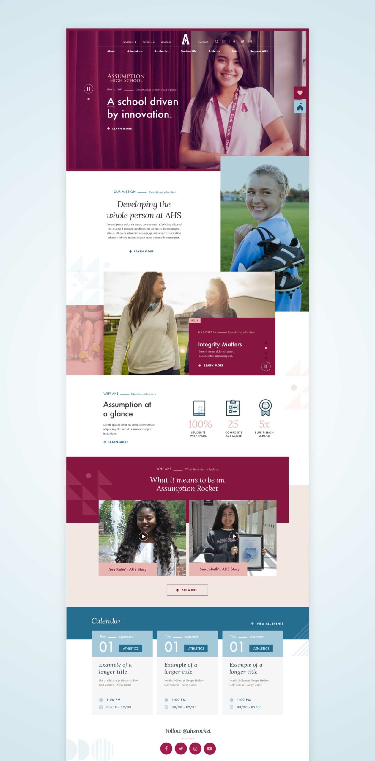
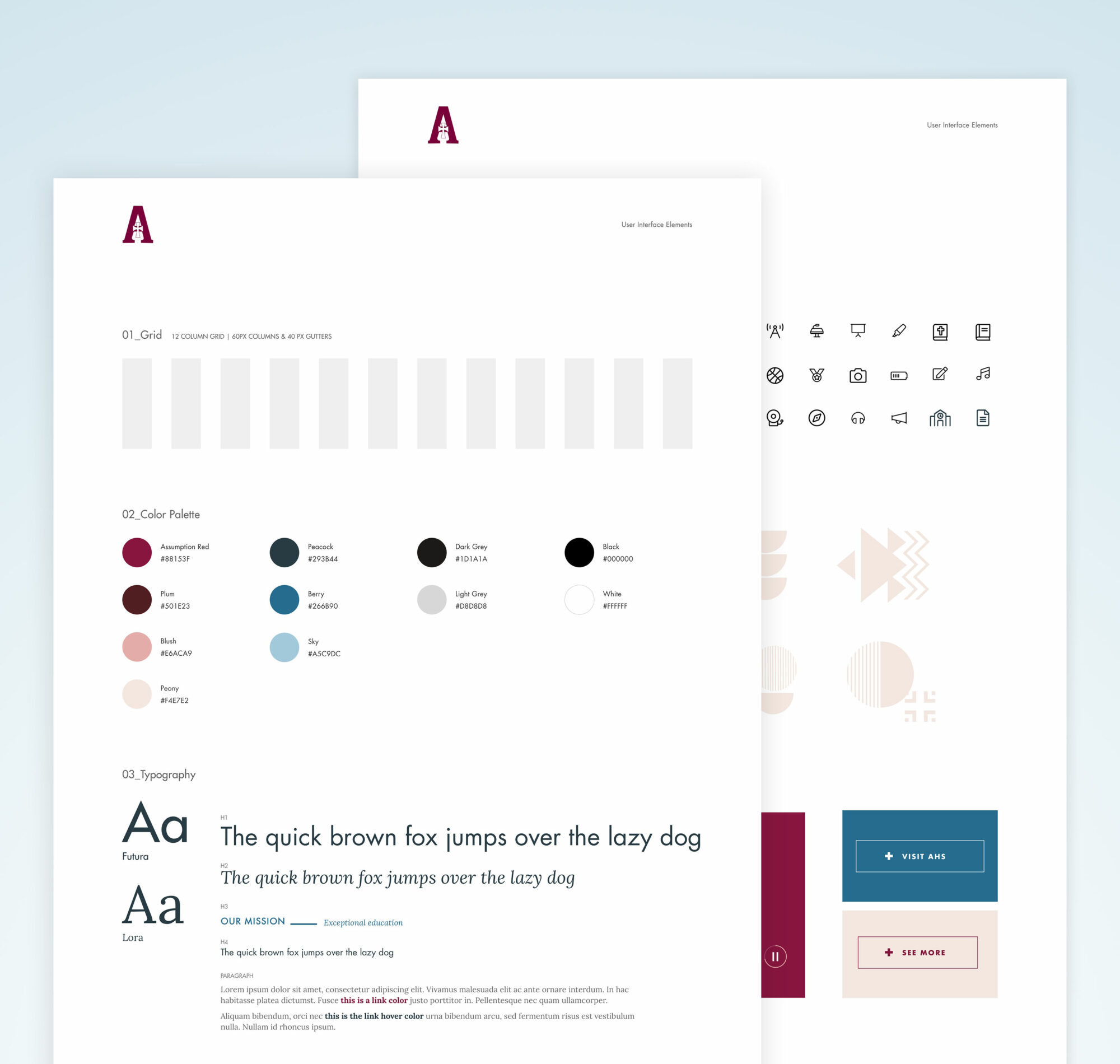
Branding & Visual Identity: We worked with the AHS team to refresh the visual identity of the website while staying true to the school’s heritage. We made sure the design was visually appealing, with a clear focus on the school’s values, history, and community. The color palette, typography, and imagery were chosen to evoke a sense of warmth, trust, and tradition.
Content Strategy: In collaboration with the AHS communications team, we developed a content strategy that highlighted the school’s achievements, upcoming events, student success stories, and alumnae testimonials. We also ensured that the site’s tone was welcoming, inclusive, and reflective of the school’s mission.
Testing & Iteration
User testing was a critical part of our design process. We conducted usability testing with students, parents, and alumnae to ensure that the website was intuitive and met their needs. We identified several areas for improvement, such as simplifying the admissions process and making event registration more streamlined.
Through iterative testing and refinement, we ensured that the final design addressed user pain points while staying aligned with the school’s goals and mission.
Results & Impact
The new AHS website launched successfully and received positive feedback from stakeholders, students, and parents. Key outcomes included:
- Increased Mobile Engagement: The mobile-friendly design led to a significant increase in mobile traffic, especially among prospective students and parents.
- Improved User Satisfaction: Feedback from users showed a marked improvement in satisfaction with the site’s ease of navigation and accessibility.
- Higher Conversion Rates: The admissions page saw a higher conversion rate for prospective students who initiated the application process directly from the website.
Reflection & Lessons Learned
Looking back on the project, several key lessons stand out:
- Stakeholder Involvement is Crucial: By involving stakeholders early in the design process—especially through activities like sketching exercises—we fostered empathy for users and ensured that the final product met everyone’s needs.
- Mobile-First is Non-Negotiable: Given the growing reliance on mobile devices, designing for mobile first was essential to the success of this project.
- Iterative Design is Key: The iterative process of testing and refining our designs based on real user feedback ensured that we created a product that was both usable and engaging.
This project was an excellent example of how a collaborative, user-centered design process can lead to a successful and impactful digital experience.
CLIENT: Assumption High School
ROLE: UX/UI Designer
CREDIT: The Power Agency
TOOLS: Sketch, UXPin, Jira, Usertesting.com
